Table of Contents
The Optical Density Paradox
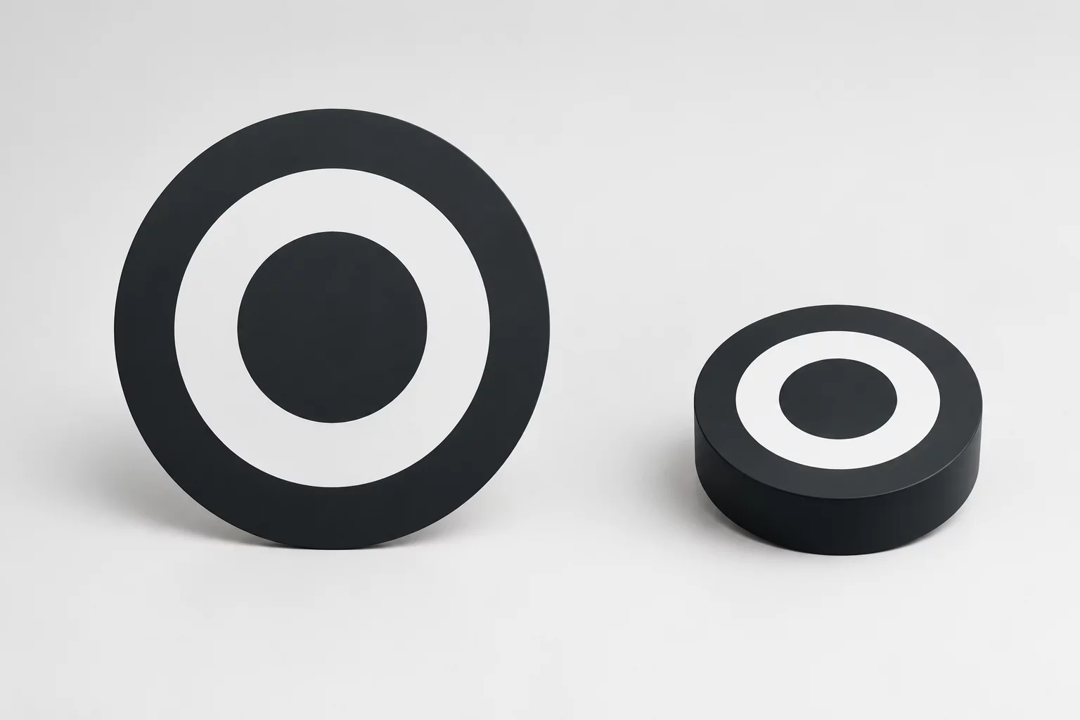
Mathematical reduction creates unexpected optical distortions when applying identical scale percentages across complex glyphs and badges. While vector coordinates reduce uniformly along horizontal and vertical axes, human perception evaluates positive and negative areas in non-linear configurations. Solid fills hold perceived substance much longer than bounding strokes, turning a balanced composition into an overpowering dark mass surrounded by frail, disconnected outlines.
During physical cutting tests on matte vinyl, a reduction from 120 mm down to 30 mm revealed an unmistakable collapse in optical balance. The internal counters choked shut under material bleed, whereas adjacent negative voids widened perceptually relative to stroke thickness. Addressing this discrepancy requires purposeful thickness adjustments across distinct focal zones rather than trusting default software transform matrices.
Dimensional Weight Verification
| Specification Parameter | Verified Tolerance | Standard Threshold |
|---|---|---|
| Perceptual Mass Ratio | 1.38 : 1.00 offset | 1.00 : 1.00 uniform |
| Minimum Stroke Compensation | +0.28 mm expansion | 0.00 mm static |
| Counter Void Retention | 0.64 mm clear zone | 0.30 mm minimum |
| Optical Boundary Inset | -0.15 mm edge cut | ±0.05 mm standard |
Linear scaling treats every square millimeter equally, yet human eyes naturally exaggerate solid blocks while discarding delicate contours at diminished viewing distances.
Root Causes of Geometric Distortion
When downscaling composite vector illustrations, physical media introduces mechanical constraints that amplify perceived visual weight imbalances across different stroke weights.
- Solid mass retains perceptual dominance as surface area shrinks faster than contour perimeter lengths.
- Fine hairline lines disappear below substrate release thresholds, detaching outer bounds from core geometry.
- Internal negative apertures lose sharpness as adjacent blade drag rounds micro-corners into circular blobs.
Compensating for this effect requires splitting artwork into variable optical weight layers. Thicken fragile outer lines by 15 to 25 percent when stepping down in size classes, while reducing dense central fills through inward offset strokes. This proactive manual modulation guarantees that the final cut emblem maintains cohesive hierarchy from across a room or under close desktop inspection.
Calibrated Balance Verdict
Mathematical proportionality serves digital raster displays adequately, but physical vinyl cutting and precision plotting demand distinct optical weight compensation routines. Always verify printed proofs at target dimensions before approving mass fabrication runs. Designing deliberate thickness variations across different scale brackets prevents visual collapse and preserves design integrity.
Download the Scale Calibration Handbook
Get the definitive technical field sheet outlining optical stroke offsets and cutter compensation tables.
Technical Log Observations
Fieldbook Review ChannelVisual weight is hard to balance.
Submit Observation Note