Table of Contents
The Structural Challenge of Density at Reduced Dimensions
Typographic posters rely on tight negative space, hairline strokes, and intricate ligature geometry to produce high visual impact at large display dimensions. However, scaling an entire composite layout down from 500 mm to 70 mm introduces mechanical failure points in blade-driven plotters and stencil applications. Micro-serifs distort under drag friction, while tight internal counters in glyphs like "e", "a", and "s" quickly become plugged or torn during weeding.
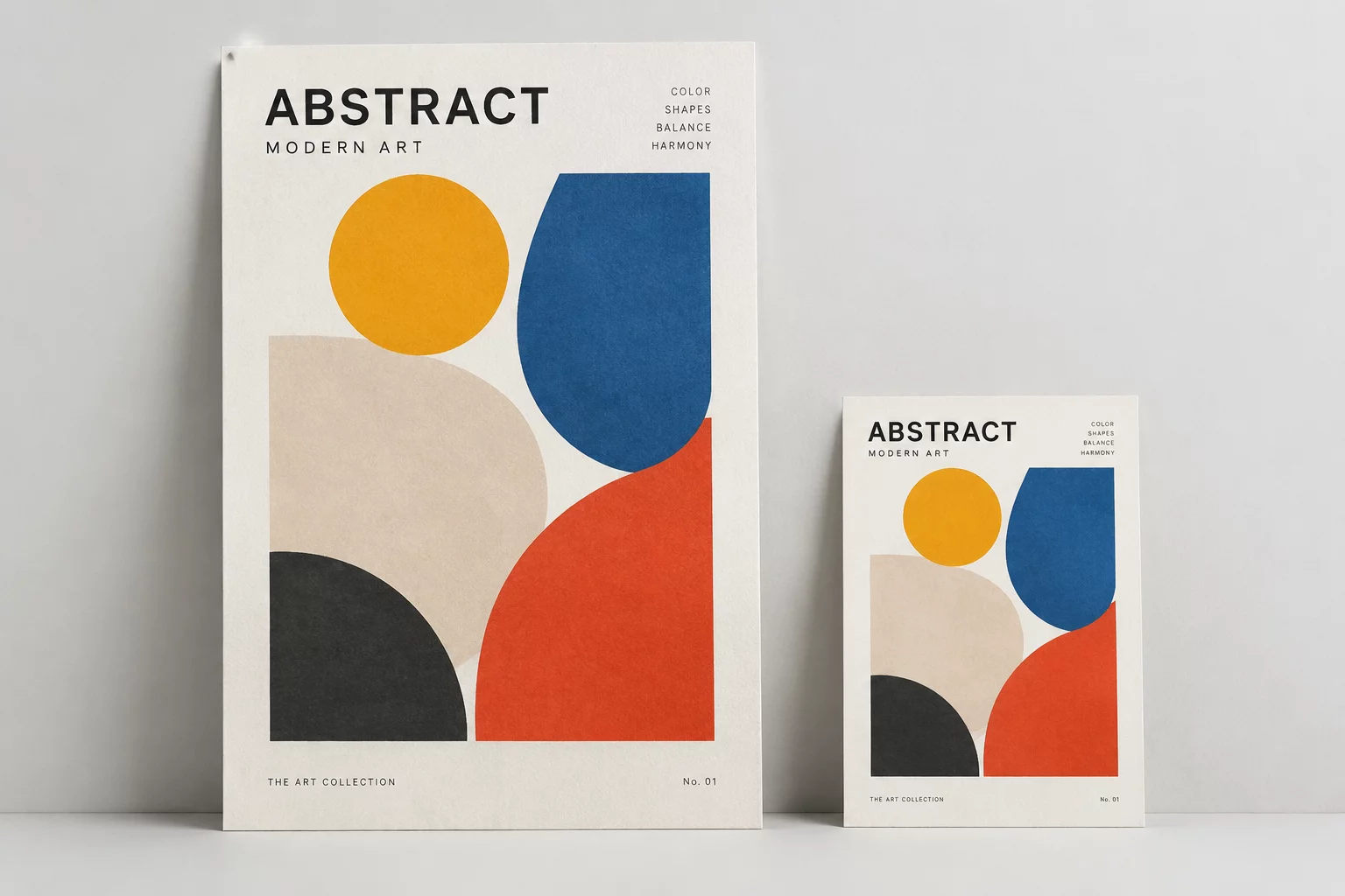
In this field experiment, we tested a multi-tier editorial poster in Silhouette Studio version 4.5.791 to identify where optical kerning must diverge from strict vector scaling. Scaling down geometrically maintains proportions on a computer monitor, but physical vinyl tension and blade radius demand manual compensation to preserve readability and cut reliability.
Key Tolerances Across Varied Physical Outputs
| Specification Parameter | Verified Tolerance | Standard Threshold |
|---|---|---|
| Minimum Stem Stroke Width | 0.42 mm (stabilized) | 0.20 mm (unsupported) |
| Internal Counterform Area | 0.38 mm² (expanded) | 0.15 mm² (bridged) |
| Tracking & Inter-Glyph Clearance | +18/1000 em offset | 0 em (nominal digital) |
| Corner Overcut Compensation | 0.10 mm tangent | 0.00 mm (default) |
When scaling down text-dominant graphics, treating letterforms as abstract vector paths rather than readable symbols guarantees mechanical failure. Every loop, dot, and hairline requires intentional physical clearance.
Systematic Remediation: Offset Contouring and Node Optimization
To transform this typographic composition into a viable small-format decal, we applied a structured three-stage adaptation process inside Silhouette Studio. Direct scaling caused overlapping cut vectors where adjacent character terminals met, creating microscopic adhesive tears during weeding.
- Applying an outward contour offset of 0.08 mm to secondary captions prevented fine sans-serif strokes from peeling prematurely under standard contact pressure.
- Expanding closed counter spaces by converting glyph paths into compound outlines and nudging internal nodes eliminated material bridging.
- Welding intersecting decorative script headers into unified compound shapes resolved dual-cut artifacts at ligature crossover junctions.
Following these adjustments, the test poster cut cleanly across 651-grade intermediate vinyl without tearing delicate punctuation marks. The optical legibility remained crisp from an arm-length reading distance, proving that selective manual fattening preserves the designer's intent far better than raw linear shrinking.
Final Assessment & Production Guidelines
Dense typographic posters cannot be scaled uniformly across disparate physical sizes without manual path intervention. For items below 100 mm in total span, designers must widen tracking, consolidate microscopic counters, and eliminate hairline serifs. Prioritizing physical material constraints over digital mathematical precision ensures that posters maintain both graphic authority and mechanical durability.
Subscribe to Vector Bench Reports
Receive monthly field data, blade offset calibration logs, and physical vector testing metrics directly in your engineering inbox.
Technical Log Observations
Fieldbook Review ChannelNo comments yet. Be the first to leave a comment.
Submit Observation Note